Friday, November 12, 2010

MAJOR PROJECT - The final touches

I felt that I had overworked the image and it was looking dull & boring. I decided to add some sunbeams and a graduated orangy-yellow light going from left to right (on new layer, then multiplied- at 50% opacity).

It looked better but still dull so I just removed a desaturating layer. I then masked out the tree on LHS so the leaves didn’t look yellow


Saturday, November 6, 2010

MAJOR PROJECT - Putting it all together

PUTTING THE IMAGE TOGETHER

1. Placing the images. When I first placed the elements, the lamb was dead centre & looked strange. It was the fatty white side of the leg of lamb. I decided to rephotograph a leg of lamb to get less white fat & streaks of muscle which made it look less like a white bag. Also I extended th leed so the lamb was on the right side of centre

2. Adding the fog & mist. I decided to do two levels of this. The first was a graduated white very opeque layer. The second was clumps of mistin the central area. To give the image depth of field it was necessary to mask out the trees closest to the front. Also the twigs & leaves so it looked consistant.

3. Added folliage. This was to make the feet look as if they were walking through the longish folliage/grass. Also there was some leaves added to the main trees as the light shining through them was too bright once the fog was applied.

4. Curves, desatiration, de-vibrance, darkening/lightening, blurring etc. These adjustnents were needed to make the elements look as if they belong inside the foggy forrest. For instance:

* Woody was blurred and slightly fogged to put him in a different plane to Chilli.

* The lamb was blurred, desaturated & de-vibranced

* Both dogs were darkened towards the back of them. Initially I tried to lighten the fronts but especially with Chil, her white face became too gleary ie too contrasty for the whole image.

* The folliage was blurred & de-vibranced to make them the same colour as the forrest floor

* The balloons had a colour change & were desaturated.

* The knot was desaturated & changed colour & slightly blurred

·


MAJOR PROJECT - ELEMENTS - 6. Foliage

FOLIAGE

To make the subjects look as if they are in the forrest it was necessary to have them walk into the follliage. So I created some folliage to slightly cover their feet. The three photos below were taken in close proximity to each other. The folliage was extracted, blurred, desaturated & de-vibranced.


MAJOR PROJECT - ELEMENTS - 5. Background

5. Background

I considered several backgrounds but decided on the burnt forrest – taken in Healesville in Victoria. This lent itself to adding a fog better than the others.


MaJOR PROJECT - ELEMENTS - 4. Balloons and Lamb

4. Balloons and Lamb

Each was photographed separately. Also there was a knot of ribbon. Initially I had photographed the other side of a leg of lamb. It was so white that when in the image it looked like a white bag. It is also situated almost in the centre so the white looked wrong. This more muscly/bloody side looks better.


MaJOR PROJECT - ELEMENTS - 3. Tom

3.Tom

I had planned to do a studio shot here. The person whom I had lined up cancelled so I decided to take this photo of my son Tom. Granddaughter Mia held the leed. The leed needed lengthening and liquifying.


Friday, November 5, 2010

MAJOR PROJECT - ELEMENTS - 2. Woody


2.Kelpie – Woody

Similarly I took a number of Woody. I wanted him looking up. I needed two of him. In one of the photos he was just about to take a bite – he pulled the meat down. Part of his foot was missing but I knew it would be behind Chilli so I did not repair it.


MAJOR PROJECT - ELEMENTS - 1. Chilli

ELEMENTS

1.Blue Heeler Dog – Chilli

I took a number of photos of her. I wanted her head looking up & her tail showing. It ended up that I needed 3 photos of her which I joined, then I needed to straighten her back with the liquifier.


MAJOR PROJECT - change of plan

Contrary to what I had planned I decided to do an image that had nothing to do with the flats in which I lived as a child in Coogee.

I decided to do something much more contemporary inspired by photographers Erik Johansson and Tom Chambers.

MY NEW PLAN

I plan to do an image of the pied piper but instead of the people following the piper I will have doge following the piper EXCEPT they are really following a leg of lamb held up with balloons which the piper is pulling along.


Tuesday, September 14, 2010

Creating Composite Imagery- MY PROPOSAL

Part BMy proposal for a composite image

Concept

This is a nostalgic type of concept.

In the early 1950s I lived in a flat at Coogee. I lived there for only 3 years but the memories are very strong for that time (from age 6 to 9). Our family had just returned from England where there were still post-war food rations. Back in Australia it seemed like the land of plenty – we could eat eggs for breakfast every morning for instance. But looking back it was a time warp. There were some residents in our flats who did not have a refrigerator (we had a small kerosene one). They had ice boxes and the ice-man delivered ice to them a couple of times a week. He carried huge blacks of ice with a type of scissor pick.

The other thing that has stuck in my mind is that bread was delivered in a horse & cart – a Clydesdale horse.

Target audience

This is really a conceptual piece although is could well be for a brand of bread or bakery.

How does your work relate to the industry in Part A

It was the work of Julia Fullerton-Batton that got me thinking along these lines. Initially I thought I could do it with an ‘Alice-in-Wonderland’ type over large person in the photo. I gave that a try but couldn’t get it to work. So I have moved a bit from that idea. Tom Chamber’s work really appeals and if this concept fails I shall do something like he does.

Elements to be created

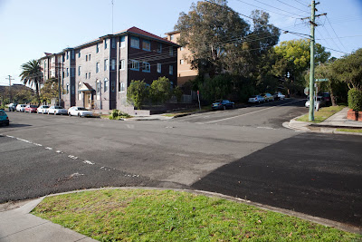
1. Background – I have taken that already – of the flats in Coogee. There are a lot of cars & some buildings that need to be hidden plus the TV antennas (no TV in early 1950s)

2. Family photo – Our family at that time was my parents & we three girls – my youngest sister was not born. Getting 1950s clothes will be difficult

3. The Ice truck.

4. The bakery horse & cart

5. A Morris Oxford – that’s the car we had brought back from England – very difficult to buy cars in Australia or overseas in the post war period.


What I have done so far & timetable for completion

1. The background: I took lots of photos and this one with plenty of space on the RHS seems to be the best. It has a good electricity pole in it as well.

2. This is the photo of my parents & two of my sisters taken by me with my Box Browney in 1954. I plan to do a similar photo with me included.

3. I took some photos recently that helped me think where I was going:


4. This is what Ice trucks looked like:


5. The 1950s Morris Oxford looks like this:

6. This is what a bakery horse & cart looks like:

Creating Composite Imagery- RESEARCH

PART A

Photographers or Advertising campagnes

1. Tom Chambers

2. McDonalds

3. Julia Fullerton-Batten

4. Peter Coulson

ANALYSIS OF ELEMENTS USED

1. Tom Chambers

Tom Chambers likes to explore the relationship between nature and people particularly young people as well as animals. His composite work is done meticulously. I love his work. In the first shot is probably 3 elements: the background, the house and the dingy with dog.

The second one is the background, the mountain made small, the boy and the boat (could have been shot together or separately), and the birds.

The third one is more weird. The background is a tunnel – probably made from a stone wall. The grid at the back is added & possibely a bit of ‘mist’ as well. The arms are all shot separately & of course the girl on her knees. The lighting is done well – all back lit.


2. McDonalds

Advertising campaigns of McDonalds are generally clever. They tend to use composite images that make the consumer look twice. Something doesn’t look quite right. The 1st ad below for Real milkshakes is of a cow on the trampoline. It is 2 or 3 images put together depending on whether the trampoline was in the field or not. The cow was certainly added.

The 2nd one is several photos: the sign, the model probably holding a tray, the food, the skis and the artificial snow on a sky background.

The 3rd is a German ad for McDonalds is more complicated. There are at least 3 images there and maybe four. There is the bloke with the newspaper; the ad for Maccas on the back of the newspaper; the image of the bloke eating his Maccas in the newspaper mirroring him behind the newspaper; and maybe even the newspaper itself was separate. Put together it is eye catching and clever. It doesn’t look stupid or too crazy and would certainly make the consumer look twice even if they don’t buy McDonalds.

3. Julia Fullerton-Batten

Julia Fullerton-Batten is a Sydney photographer and has won numerous prestigious awards for her photography. She has exhibited in exhibitions worldwide and has agents selling her work throughout the world. She has taken portraits of many well known people but it is her composite work that is so eye catching. On her website she refers to it as her ‘teenage’ images and her ‘school play’ images.

Julie was born in Germany. It was her growing up in the US and Germany that inspired her Teenage Stories. Her model in the images far outsize the landscape giving it an Alice in Wonderland’ feeling.

The 1st three of the four images below are not complicated composites. There is generally only two images combined (1st & 3rd). The 2nd one has 3 images combined. She has just shrunk the backgrounds (or made her girls much bigger 7 combined them. She has added a few shadows to make the girls stick to the ground.


4. Peter Coulson – he is a Victoria based photographer who specilises in beautiful fashion that is a bit outrageous. Most of Peter’s work is done in the studio but he does from time to time do composite images. He will take a perfect photograph in the studio & drop it into an interesting background. These two images below were for an underclothes company.

In the first image Peter’s client thought that peter could go into the museum with all his gear & set up to take the photograph with the model. He explained to his client that it would not be possible as he had 2 generators plus all his lights & cameras. Nevertheless she asked the owner if it was possible & was surprised to get the knock back. Then Peter went & asked the owner if he just take some photos inside & he said he would give the owner some prints. That was OK. So it is a composite.

The 2nd one is also a composite. He took the flag blowing in the wind; rephotographed the photograph to get texture. He took the photo of the model separately on a dark background which he turned black & dropped her in – he put a screen bland. The hair was perfect.

REFERENCES

NOTE: Each of the images is referenced under the photo.

McDonalds: The design inspiration; http://www.google.com.au/imgres?imgurl=http://thedesigninspiration.com

/wp-content/uploads/2009/08/mcdonald/McDonald-Ads-32.jpg&imgrefurl=http:

//thedesigninspiration.com/articles/40-clever-advertising-campaigns-of-

mcdonalds/&usg=__TWvRgkhX9Wzgc7oV7LVhK8e4wRg=&h=350&w=552&sz=53&hl=en&start

=5&tbnid=2IO6hKbE9pkzWM:&tbnh=84&tbnw=133&prev=/images%3Fq%3Dadvertising%2B

campaigns%26um%3D1%26hl%3Den%26sa%3DX%26biw%3D894%26bih%3D708%26tbs%3Disch:

10%2C9330%2C933&um=1&itbs=1&biw=894&bih=708

http://www.canon.com.au/en-au/About-Canon/News-Events/Events/Peter-Coulson